
Despite July being a five-Friday month, I had fewer titles to choose from than June—the big-name releases hope to monopolize screens post-Independence Day. The Minions ride solo this weekend (save for Angel Studios) and Spider-Man slings his web in virtual isolation four weeks later… besides a Gregg Araki sex romp in wide release(!). Add Moana and Maui’s live-action debut and family fare reigns supreme.
So don’t let the other titles get lost in the shuffle as they’re relegated to the small auditorium at the back of your multiplex. The below posters represent a mix of studio productions and independents all vying for your time. Let the kids enjoy their favorite IP’s latest installments, then treat yourself to the rest while they sleep off their sugar comas at home. There’s a little something for everyone.
Heavy drama


Is Christopher Nolan’s The Odyssey (July 17) an exception to the rule? Maybe. It too seeks to stand alone as the only wide release of its week, but Homer isn’t quite on par with Stan Lee when it comes to getting the kids excited for an epic adventure.
That’s why LA (the above teaser and the one with the “spine” helmet) and BOND (the one with the Trojan horse) decided to lean into its dark drama with their series of posters. They went mood over color—much like BOND did on Nolan’s previous Oppenheimer. Put those two teasers together and you must wonder if he’s going the way of Sean Baker and branding himself with a consistent font and vibe: smoke and embers.


Regardless of aesthetic through lines, these sheets are just great examples of setting tone. The poses and war-like environments show how earnest this adaptation will prove with a devastating emotional cost. They are a series of snapshots to whet appetites while contrasting the brightness of its animated counterparts.
You get a bit of that with Brandon Winters’ (photography by Lidia Nikonova) poster for Night Nurse (limited, July 10) too. The up-close composition shrouded in shadow practically plants a whisper in your ears as you wonder what is being said into that telephone receiver. Or is her mouth agape in shock at what she’s heard from the other end?
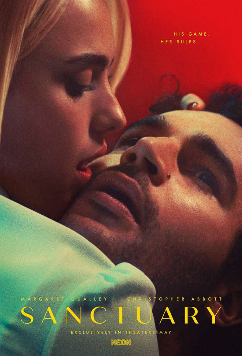
It’s dramatic, sensual, mysterious—very much like Alex Johnson and Empire Design’s Sanctuary from a couple years ago. It calls into question whether we’re witnessing the victim of the scam calls running through a retirement community or the perpetrator. Maybe there’s a scenario where this character is revealed as both.
And by moving all the text to the bottom left, we’re able to lose ourselves in that mystery. The designer allows us to get that pertinent information on our own time while ensuring the visual clarity of the image isn’t sacrificed.
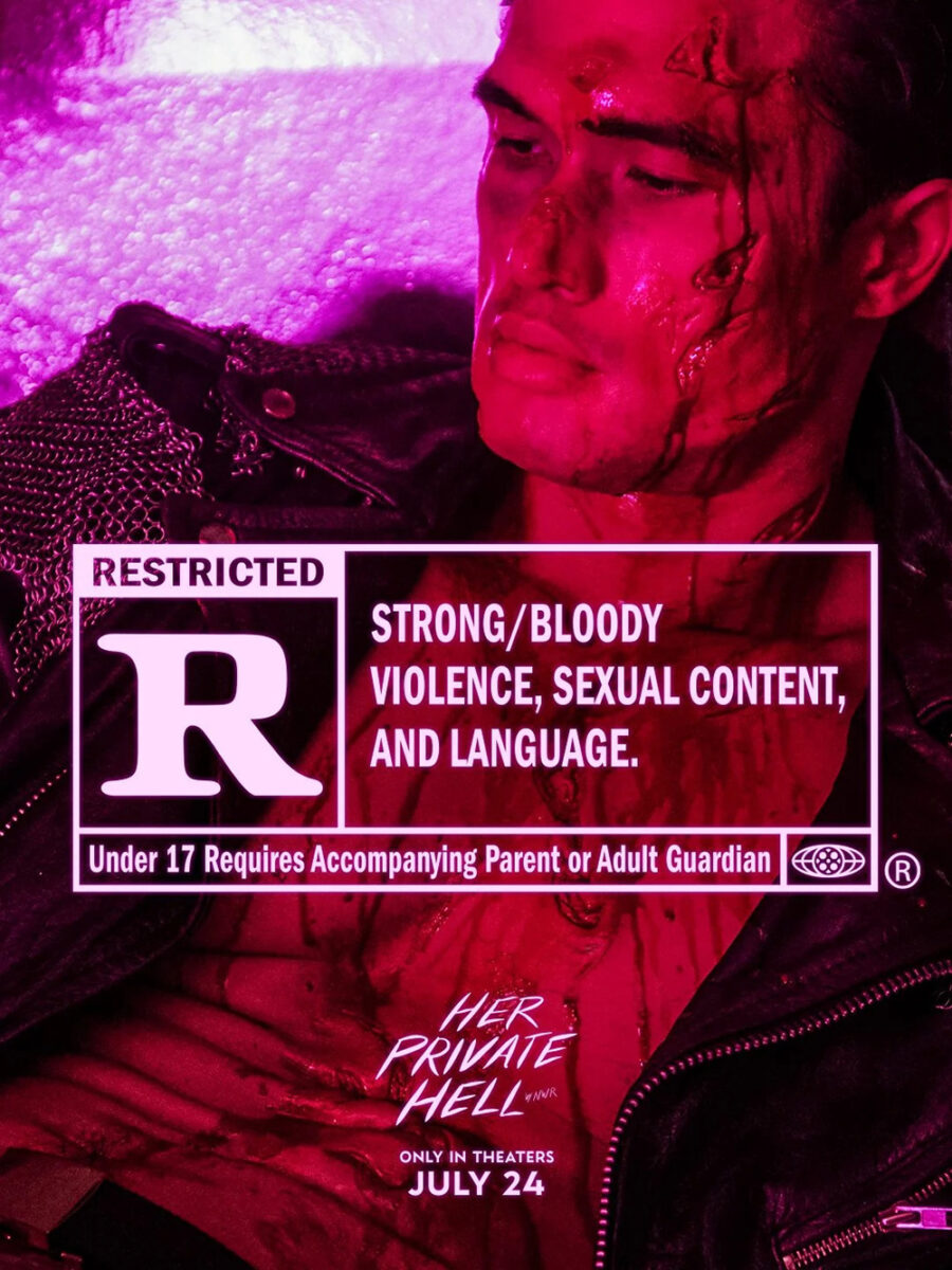
Her Private Hell (July 24) is similar for how it mostly keeps image and text separate. It’s not quite as effective at that separation—centering the latter that way forces our eyes to hit it directly—but it works: that straight line down from cast names to release date runs parallel with the line of sweat running down Charles Melton’s chest.
As Nicolas Winding Refn is wont to do with his posters, this one is bathed in neon light to give the entire frame a cool hue of filtered color. I don’t love the typeface for the title, but maybe its playfulness is meant to cut through the more severe Scorpio Rising vibes of the whole.
It’s a brilliant companion to the very R-rated-forward teaser of a bloodied, mutilated Melton crumpled into the poster’s corner. You must love that rare case where the final sheet strips things down to be less overt than its tease.
Squares


The concept behind Do You Love Me (limited, July 10) is an intriguing one as far as creating a historical document about Lebanon via seventy years of archival footage spanning television, film, home video, photography, etc. For a country without a national archive, the documentary is built to be “love letter” to its “collective psyche.”
So of course Original Cosmic’s Frank Essam would utilize part of that footage for the poster. More than that, however, he adds a CRT filter to transform the one-sheet into a TV screen upon which this image of Beirut is projected. We become the people in this car gazing upon the city. We witness the beauty of the moment and, perhaps, its tragedy depending on the cause of that billowing smoke.
It’s also a seemingly impossible frame for depicting the inside and outside of the car simultaneously. I haven’t seen the film, but I do wonder if it’s an amalgamation of two scenes: the vehicle and the city. Add the all-yellow text and laurels stacked upon the trisected visual and you get a vintage, washed-out feel that’s at risk of disappearing with the click of a remote.
Barrio Triste (limited, July 10) goes the opposite direction. Rather than additive to create a scene, the designers are subtractive by erasing both the environment behind its seated young man and the fidelity of the imagery itself. From the jagged mask job surrounding him to the enlarged-way-past-its-capability bitmapped title, the whole point seems to be lo-fi, first-generation tech from the 1980s.
Once you spy the name Harmony Korine and EDGLRD’S signage—it’s no coincidence that the logos maintain a crispness the rest does not; those financiers and festivals probably wouldn’t take kindly to ruining their brand—you know it was an intentional decision. You also must question whether it might have been created with AI, considering Korine’s penchant for pep rallies championing new technologies. Or maybe it was simply constructed in Microsoft Paint.
Regardless, it’s unlike any of the glossy marketing materials being hung next to it. The stark-white page blinds you. The pixelation confounds you. And that face of anger paired with his makeshift machete can’t help but frighten you.
Derek Gabryszak goes with a white page for The Kidnapping of Arabella (limited, July 17) too, but he maintains the artwork’s fidelity en route to manufacturing a three-by-four grid of images alongside a brightly colored palette for the text.
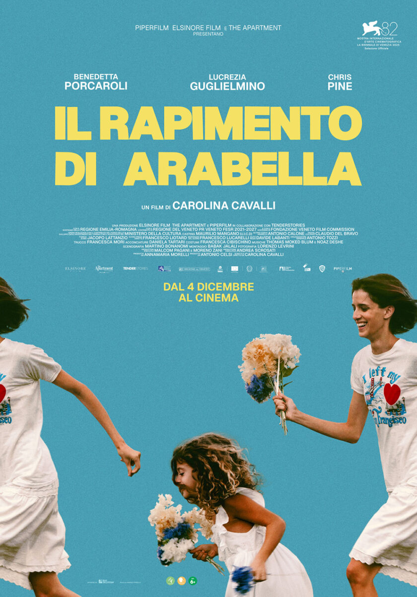
It’s a nice composition, everything centered upon the y-axis from a Berlin victory note to the distributor’s icon. The red, blue, orange, and green alternate as though blinking lights leading us through the lines of names and stacked title. And the portraits themselves range from actors to actions (the loading of a gun and application of lipstick) to absurdity via a painting and a… person in a chicken costume?
There’s something calming to its clean structure that complements BIG JELLYFISH®’s Italian iteration. The latter goes for motion as it contrasts that grid with a scene showing a woman and little girl running. It then crops that activity in a way that splits the woman in half to bleed off both sides of the page. The result is the creation of a loop: both perpetually running despite standing still.
Humans need not apply


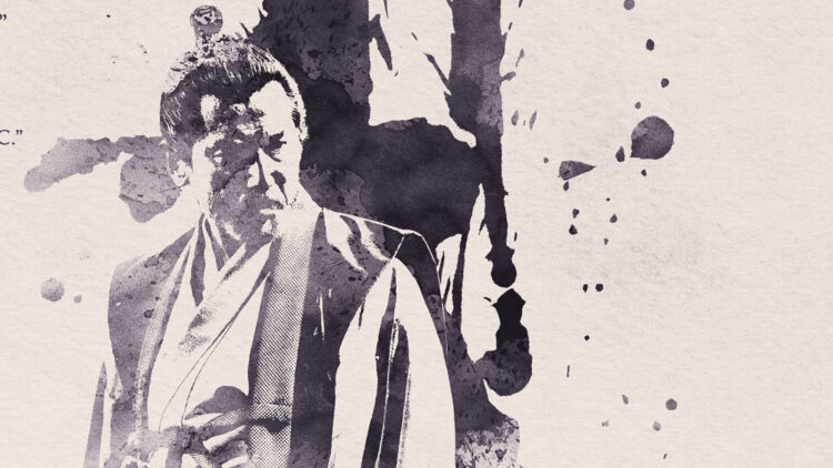
While Brandon Schaefer and Jump Cut’s final poster for The Samurai and the Prisoner (limited, July 31) does provide a look at its two leads via ink-blot portraiture, I love how their teaser goes the figurative route instead. It’s a perfect distillation of this story: a samurai seeking an escape from the castle in which he’s barricaded himself with the enlisted help of a prisoner he arrested. If that’s not a spider’s web of intrigue built from the shackles of the dungeon, I don’t know what is.
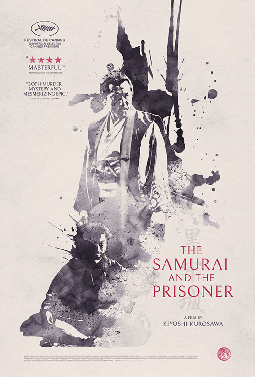
The composition isn’t just slapping a depiction of that metaphor onto the center of the page, either. There’s a very conscious shift into the top left of the page to create motion on the diagonal and balance to the bottom right so the title, Cannes laurel, and studio logo can be enlarged rather than jammed in small somewhere else. The frame is bisected so our eyes can move from one half to the other while following that spider’s trail.
The final sheet utilizes a similar separation by allowing the imagery to offer a wall between top left and bottom right. Its ink slashes through the middle to form a foundation for the text in those corners to float. These are two solid pieces augmented by their thematically specific artistic flourish.
Lauren King and Haruko Hayakawa’s poster for Wild Inside (limited, July 31) doesn’t need to worry about humans—the film’s lead is Flaco the Eurasian eagle-owl. So it’s no surprise that he’s presented front and center above a wonderfully rendered stone perch that overlooks a miniature New York City: it’s the place in Central Park from which he escaped captivity.
This is a fun visual that marries the idea of the animal adventuring through the real world with the staid, museum-like display-case artistry one might find a stuffed version of his species on land. It’s the same sort of dynamic that the title plays with in visual form; the designers do well to let it speak for itself while pushing the title to the top and all other text to the bottom. This is very much Flaco’s show.
As for Rosebush Pruning (limited, July 24), its poster is less concerned with not using humans than erasing them completely. Because Callum Turner is obviously there. This is a portrait of him staring into the camera. His face should be visible.
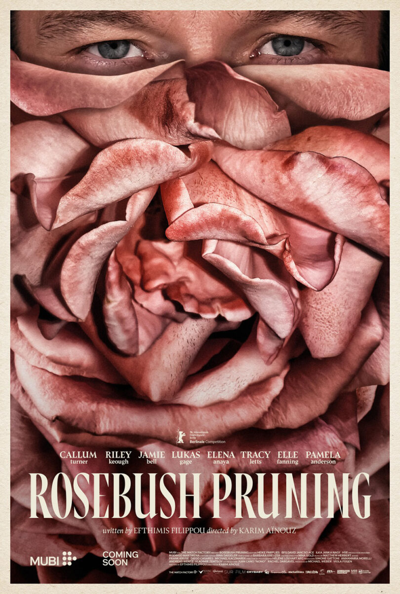
What we get instead are enlarged flower petals to create the latest wild piece in Vasilis Marmatakis’ surreal oeuvre. More than just juxtaposing them atop the image, however, he’s permanently affixed them with four screws. This isn’t about hiding a face for the purposes of manufacturing mystery, but replacing him. You can even imagine the whirr of the drill as it spins those screws down. Thankfully, there aren’t also a few rivers of blood dripping down from the holes.
Marmatakis’ second sheet wields the same concept in a different way, filling its frame with rose petals so we can only see Turner’s eyes at the very top. Thus there’s less intent. Rather than conjuring the act of erasure, it seems the actor contracted an infection—it looks more like mushrooms or tree fungi than flowers. Where the first was strangely evocative in its sense of danger, this one feels quaint by comparison.
The post Posterized July 2026: The Samurai and the Prisoner, The Odyssey, Night Nurse & More first appeared on The Film Stage.
from The Film Stage https://ift.tt/UbVCDTj


0 Comments